


The History of Map Projections: Understanding Why Our Maps Look Different
We rely on maps every single day, whether it's navigating to a new restaurant, planning a trip across continents, or analyzing global data. Maps provide us with an indispensable window into the world around us, offering a simplified yet powerful representation of complex geography.
However, have you ever stopped to wonder why different maps of the same area, especially the entire world, can look so remarkably different? Why does Greenland appear so massive on some maps, larger than South America, when in reality it is significantly smaller?
This visual variation is not a mistake; it is a direct consequence of one of the oldest and most persistent challenges in cartography: how to accurately depict our spherical Earth on a flat, two-dimensional surface. The solution lies in understanding map projections, mathematical methods used to translate locations from a 3D globe to a 2D plane.
This post will take you on a journey through the fascinating history of map projections. We will explore the fundamental problem they address, trace their evolution from ancient times to the modern era, examine the most influential projections and their creators, and crucially, explain the inevitable trade-offs that each projection makes.
By delving into this history, you will gain a deeper appreciation for the art and science of mapmaking and, most importantly, acquire the knowledge to look at any map and understand why it looks the way it does, recognizing its strengths and its inherent distortions. This understanding is the key to interpreting maps correctly and appreciating the incredible ingenuity that has gone into creating them over millennia.
What Exactly is a Map Projection? Facing the Fundamental Challenge
Imagine trying to flatten an orange peel into a perfect rectangle without tearing or stretching any part of it. You quickly find that this is impossible; you either have to cut it in places or deform its shape and size.
Representing the Earth's curved surface on a flat map presents a similar, fundamental challenge. The Earth is, roughly, a sphere (or more accurately, an oblate spheroid), a three-dimensional object with constant curvature. A map, however, is a flat surface, possessing no curvature.
A map projection is essentially a systematic method for translating the coordinates of points on the Earth's curved surface (latitude and longitude) onto corresponding points on a flat plane. This translation is a complex mathematical operation, not a simple physical act of "peeling" and flattening.
Because this transformation from 3D to 2D is topologically impossible without alteration, every single map projection inherently introduces some form of distortion. This distortion affects properties like area, shape, distance, and direction.
The core task of any map projection is to manage this distortion in a controlled and predictable way, deciding which properties to preserve accurately at the expense of distorting others, based on the intended purpose of the map. There is no single "perfect" projection that accurately preserves all spatial properties simultaneously over the entire globe.
Early Attempts: Mapping the World Before Modern Projections
The desire to map the world dates back to ancient civilizations. Early mapmakers, lacking the sophisticated mathematical tools available today, still grappled with representing portions of the known world on flat surfaces like clay tablets, papyrus, or parchment.
These early maps were often more schematic than precise, focusing on showing relative locations, travel routes, and significant landmarks. While they might not have employed formal mathematical projections in the modern sense, the act of drawing a curved segment of the Earth onto a flat surface implicitly involved a form of projection, however intuitive.
The ancient Greeks made significant strides in understanding the Earth's spherical nature and developing systematic geography. Figures like Eratosthenes famously calculated the Earth's circumference, establishing the spherical model as the basis for cartography.
Claudius Ptolemy, working in Alexandria in the 2nd century AD, represents a pivotal figure. His monumental work, "Geography," not only compiled existing geographical knowledge and provided coordinates for thousands of locations but also discussed methods for creating maps.
Ptolemy described and used projections that were based on geometric reasoning, including a conic projection and a pseudocylindrical projection for world maps. These were among the earliest documented attempts to apply mathematical principles to the problem of mapping the sphere onto a plane, influencing mapmakers for well over a thousand years.
Despite these early efforts, large-scale, accurate mapping remained challenging. Maps often contained significant inaccuracies outside of limited, well-surveyed areas, and the full implications of projection distortion were not deeply understood. The stage was set for future innovations driven by expanding human knowledge and exploration.
The Age of Exploration: A Driving Force for Innovation
The period often referred to as the Age of Exploration, roughly from the 15th to the 17th centuries, dramatically increased the need for accurate and reliable maps. European powers were embarking on long-distance sea voyages, discovering new lands, and establishing trade routes across oceans.
Navigation at sea required maps that could do more than just show places; they needed to facilitate plotting courses accurately. Sailors needed to be able to steer a constant compass bearing (a rhumb line or loxodrome) and have it correspond to a straight line on the map.
Existing maps and projections were often insufficient for this task. They might preserve area or direction from a central point, but they did not render rhumb lines as straight, making plotting long ocean voyages complicated and error-prone.
This pressing need for a navigation-friendly map projection spurred cartographers to develop new techniques. While land-based mapping and astronomy were advancing, it was the demands of ocean navigation that provided the key impetus for a major breakthrough in projection design.
The commercial and political stakes of overseas exploration and trade were immense. Accurate maps provided a strategic advantage, making the development of improved mapping methods a high priority and a significant investment of intellectual effort.
The Breakthrough: Gerardus Mercator and His Projection
It was against this backdrop of urgent practical need that Gerardus Mercator, a Flemish cartographer, introduced his revolutionary projection in 1569. His map, titled "Nova et Aucta Orbis Terrae Descriptio ad Usum Navigantium Emendate" (A New and More Complete Representation of the Terrestrial Globe Properly Adapted for Use in Navigation), explicitly stated its purpose.
Mercator did not invent the cylindrical projection concept, but he devised a unique mathematical method for spacing the parallels of latitude. On a simple cylindrical projection like the Plate Carrée (where latitude and longitude lines form a grid of equal squares), rhumb lines appear as curves.
Mercator's genius was to increase the spacing between parallels as they move away from the equator. This stretching exactly compensated for the stretching of the meridians (which are parallel on a cylindrical projection instead of converging at the poles), so that at any point on the map, the local shapes of features are preserved (the projection is conformal).
Crucially for navigators, this conformality had the effect of rendering all rhumb lines as straight segments. A sailor wanting to sail from point A to point B on a constant bearing could simply draw a straight line on the Mercator map and read the required angle.
The Mercator projection was not without its significant drawbacks. While it preserved shape (conformality) and direction locally, it drastically distorted areas, especially at higher latitudes. Landmasses near the poles, like Greenland and Antarctica, appear disproportionately large.
Despite this area distortion, its unparalleled utility for navigation meant the Mercator projection quickly became, and remained for centuries, the standard projection for world maps and nautical charts. Its visual familiarity has also made it perhaps the most recognizable map projection in the world, shaping many people's perception of the relative sizes of countries.
Exploring Different Projection Families and Their Geometry
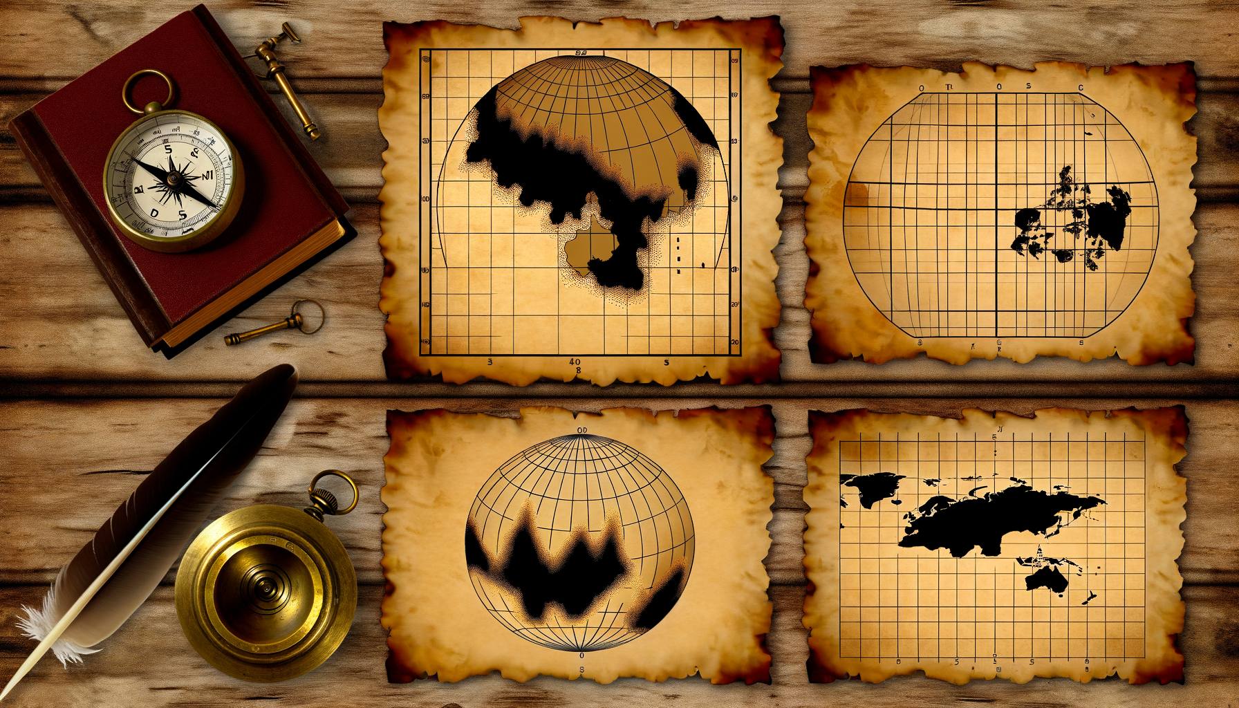
While there are thousands of named map projections, most can be conceptually understood as being derived from three basic geometric shapes onto which the globe's surface is projected, or as modifications of these basic types.
These conceptual models – the cylinder, the cone, and the plane – help visualize the transformation process and often explain the pattern of distortion inherent in the resulting map.
Projections can be tangent (touching the globe at a single line or point) or secant (intersecting the globe at two lines or a circle). Along the lines or points of tangency/secancy, distortion is typically minimal or zero.
Understanding these basic families provides a framework for classifying and comprehending the vast array of projections that cartographers have developed over time for various purposes.
Cylindrical Projections
Conceptualizing a cylindrical projection involves wrapping a cylinder of paper around the globe, tangent to it typically at the equator (or secant at two parallels). Points from the globe's surface are then projected onto the cylinder.
The cylinder is then unrolled into a flat rectangle. Meridians (lines of longitude) appear as equally spaced vertical parallel lines, and parallels (lines of latitude) appear as horizontal parallel lines.
The spacing of the parallels is where different cylindrical projections vary significantly. As discussed, the Mercator projection spaces them increasingly further apart towards the poles to achieve conformality.
Other cylindrical projections exist. The Plate Carrée projection (also known as the Geographic or Equidistant Cylindrical projection) spaces parallels equally. This makes distances along meridians and the equator accurate, but distorts shape and area significantly away from the equator.
Cylindrical projections are often used for world maps or regions near the equator. They typically show the entire globe (excluding extreme polar regions which might be infinitely stretched).
Conic Projections
Conic projections are conceptualized by placing a cone over the globe, with its axis aligned with the Earth's axis. The cone can be tangent to the globe along a single parallel of latitude (a standard parallel) or secant, intersecting the globe along two parallels.
Points are projected from the globe onto the cone, which is then unrolled into a flat shape resembling a section of a circle (a fan or wedge). Meridians appear as straight lines radiating from the apex of the cone, and parallels appear as concentric circular arcs.
Conic projections are particularly well-suited for mapping mid-latitude regions that extend further in east-west direction than north-south, such as the continental United States or Australia.
Distortion is generally lowest near the standard parallel(s). Area and shape distortion increase as you move away from these parallels.
Famous examples include the Albers Equal-Area Conic projection, which preserves area and is often used for thematic maps of countries like the US, and the Lambert Conformal Conic projection, which preserves shape (conformality) and is often used for aeronautical charts and mapping large countries. Ptolemy's early projection described in his "Geography" was also a form of conic projection.
Azimuthal Projections (or Zenithal Projections)
Azimuthal projections are conceptualized by placing a flat plane tangent to the globe at a single point (the central point), or secant, cutting through the globe. The projection is made from a perspective point, which can be the center of the Earth, a point on the opposite side of the Earth, or a point infinitely far away.
On an azimuthal map, lines of constant compass bearing (azimuths) from the central point are represented as straight lines. Meridians typically appear as straight lines radiating from the central point, and parallels appear as circles centered on that point.
The point of tangency or the center of the map is crucial for azimuthal projections. They are often centered on a pole, in which case meridians radiate outwards and parallels are concentric circles.
Different types of azimuthal projections result from varying the perspective point and the method of spacing parallels.
Examples include the Gnomonic projection (perspective from Earth's center), which shows all great circles (like the shortest path between two points on the globe) as straight lines, useful for navigation planning despite significant distortion away from the center.
The Stereographic projection (perspective from opposite side) is conformal and used for mapping polar regions or for detailed topographic maps at large scales.
The Orthographic projection (perspective from infinite distance) simulates the view of the globe from space and is not conformal, equal-area, or equidistant, but is useful for illustrative purposes.
The Azimuthal Equidistant projection preserves true distances from the central point and true direction (azimuth) from the central point. This is often used for maps showing airline distances from a city or for mapping polar regions from the pole.
The Inevitable Trade-offs: Understanding Distortion Types
As established, transforming the Earth's curved surface to a flat plane inevitably introduces distortion. Different projections are designed to minimize or eliminate distortion of one or two specific properties, but this always comes at the cost of exaggerating distortion in other properties.
Understanding the types of distortion is crucial for interpreting what a map accurately represents and what it warps. The main properties subject to distortion are area, shape, distance, and direction.
No single projection can preserve all four of these properties accurately over the entire globe. Cartographers must choose which properties are most important for the map's intended use and select a projection accordingly.
This necessity of choice explains why such a diverse range of projections has been developed throughout history; each one represents a different strategy for managing the unavoidable distortions inherent in mapping a sphere onto a plane.
Area Distortion: The Challenge of Equal Representation
Area distortion means that the relative sizes of features on the map do not correspond to their relative sizes on the Earth's surface. On maps with significant area distortion, a small country might appear larger than a large country, or vice versa.
Projections that preserve area are called equal-area or equivalent projections. On these maps, a square inch anywhere on the map represents the same number of square miles on the Earth as a square inch anywhere else on the map.
Equal-area maps are crucial for thematic mapping, where the map is used to show the distribution or density of a phenomenon across geographic space, such as population density, land use, or resource distribution. If area is not preserved, comparisons between different regions based on visual area can be misleading.
Famous examples of equal-area projections used for world maps include the Mollweide, Eckert IV, and Gall-Peters projections. The Gall-Peters projection, in particular, gained prominence in the late 20th century as an alternative to the Mercator, specifically designed to show the correct relative sizes of continents and countries, albeit with significant shape distortion.
On equal-area projections, achieving accurate area preservation usually requires distorting shapes and angles, especially towards the edges of the map. Features might appear stretched or compressed.
Shape Distortion: Maintaining Local Forms
Shape distortion occurs when the shapes of geographic features on the map are altered compared to their true shapes on the Earth. This distortion is often measured by looking at the angles between lines on the map; if angles are preserved, local shapes are preserved.
Projections that preserve shape are called conformal or orthomorphic projections. On a conformal map, angles at any point are preserved, and the scale is the same in all directions from any given point (though the scale may vary from one point to another).
Conformal maps are essential for tasks requiring accurate representation of local shapes and angles, such as navigation (as seen with Mercator) and precise surveying and engineering.
The Mercator projection is the most famous conformal world map projection. Other conformal projections include the Lambert Conformal Conic (used for many national and regional map series) and the Stereographic projection.
While conformal maps preserve local shapes, they necessarily distort areas, often severely. As seen with the Mercator, area distortion increases dramatically with distance from the projection's standard lines or points.
Distance Distortion: Measuring Between Points
Distance distortion means that distances measured on the map are not proportional to the true distances on the Earth's surface, or that the scale of the map varies significantly depending on location and direction.
While no projection can preserve true scale and distance in all directions from all points, some projections are designed to be equidistant. An equidistant projection preserves true distances from one or two specific points, or along specific lines.
For example, an Azimuthal Equidistant projection centered on a city shows the true distance from that city to any other point on the map. Distances between two points that do not involve the central point will likely be distorted.
The Plate Carrée (Equidistant Cylindrical) projection preserves distances along all meridians and along the equator, but distances along other parallels or oblique lines are distorted.
Equidistant maps are useful for applications where accurate distance measurement from a specific location is important, such as airline route maps centered on a hub city.
Direction Distortion: Bearing Between Points
Direction distortion means that the angles representing compass bearings (azimuths) between two points on the map do not correspond to the true bearings on the Earth's surface.
Projections that preserve true direction from a single, central point are called azimuthal projections (hence the name). As discussed earlier, on these maps, a straight line from the central point to any other point gives the correct compass bearing.
The Azimuthal Equidistant projection, for instance, preserves both distance and direction *from the central point*. The Gnomonic projection preserves direction *along great circles*, meaning a straight line on the map shows the initial direction of the shortest path between two points, even though intermediate bearings along that path might change.
For applications like planning aircraft or ship routes that follow great circles, projections that preserve direction in some way are valuable.
A Historical Tapestry of Projections and Their Purposes
The history of map projections is a story of cartographers continuously seeking new ways to balance these competing demands of accuracy and utility. Each new projection developed was often a response to a specific need or an attempt to improve upon existing methods.
Beyond the major families and the famous Mercator, countless other projections have been devised over the centuries, each with its own unique properties and visual characteristics. Some aimed to minimize overall distortion, while others prioritized aesthetics or specific analyses.
The Mollweide projection (developed by Karl Brandan Mollweide in 1805), for example, is a pseudocylindrical equal-area projection. It is often used for world maps displaying global distributions because it preserves area while presenting a curved, visually appealing shape.
The Sinusoidal projection (its principles known earlier, formalized later) is another pseudocylindrical projection that is equal-area and also preserves distances along all parallels and the central meridian. It exhibits characteristic curved meridians.
The development of these and other projections reflected a growing understanding of the mathematical principles involved and the diverse range of purposes maps could serve beyond just navigation.
The creation of projections became a blend of scientific rigor and artistic compromise, aiming to create representations of the world that were both informative and fit for purpose.
Why So Many Projections? The Purpose-Driven Map
The sheer number and variety of map projections available today might seem overwhelming, but they exist precisely because there is no single "best" map projection for everything. The choice of projection is always driven by the purpose of the map.
If you are creating a map to show the shortest air or sea routes between a central location and other points, you would likely choose an Azimuthal Equidistant projection centered on your origin point. This is because preserving true distance from the center is your priority.
If you are creating a thematic map showing, for instance, the global distribution of a resource or population density, you absolutely need an equal-area projection like Mollweide or Gall-Peters to ensure that visual comparisons of area are accurate and not misleading.
For detailed topographic maps used for surveying or engineering, or for aeronautical charts where local shapes and angles are critical for accurate measurements, a conformal projection like Lambert Conformal Conic or Transverse Mercator would be appropriate.
World maps intended for general reference or wall displays often use compromise projections that do not strictly preserve any single property perfectly but attempt to minimize overall distortion of shape and area, creating a more aesthetically pleasing view of the whole globe.
Examples include the Robinson projection (developed in 1963), which was widely adopted by National Geographic for many years, or the Winkel Tripel projection (developed in 1921), which is now commonly used as it achieves a good balance among area, direction, and distance distortion.
The historical development of map projections is thus intricately linked to the evolving uses of maps themselves, from navigation tools to scientific instruments and popular representations of the world.
Projections in the Digital Age
With the advent of Geographic Information Systems (GIS) and digital mapping, the use and selection of map projections have become both more complex and more accessible. GIS software allows users to easily switch between different projections and reproject data, but it also requires a clear understanding of coordinate systems and projection properties.
Geographic data is typically stored using a geographic coordinate system (like latitude and longitude on a spherical model of the Earth). However, to display or analyze this data on a flat screen or printout, it must be projected.
Many online mapping services, like Google Maps or OpenStreetMap, use a variation of the Mercator projection called "Web Mercator." While visually similar to the traditional Mercator, it is technically slightly different and has become a de facto standard for web mapping due to its computational efficiency and suitability for displaying small areas with minimal apparent distortion.
However, Web Mercator retains the severe area distortion of the traditional Mercator, which is important to remember when viewing global data on these platforms.
Modern cartography utilizes thousands of different projections, many of which are specifically designed for mapping small regions or specific countries with minimal distortion within those areas. The Transverse Mercator and State Plane Coordinate Systems are common examples used for accurate mapping within limited zones.
While the underlying mathematical principles remain the same, digital tools have made the application and understanding of map projections more important than ever for anyone working with spatial data.
Conclusion: Navigating Our Mapped World
The history of map projections is a testament to human ingenuity and our persistent desire to understand and represent the world around us. From the geometric musings of ancient Greeks and the practical needs of Age of Exploration navigators to the complex algorithms of modern GIS, the evolution of map projections tells a story of balancing the impossible task of flattening a sphere with the specific requirements of different map users.
Every flat map of a curved surface is a compromise, a carefully constructed lie that tells a specific truth. It is the projection chosen that dictates which truths (area, shape, distance, direction) are preserved and which are sacrificed.
The next time you look at a world map, whether on a wall, in an atlas, or on your screen, take a moment to consider the projection being used. Ask yourself what properties seem to be emphasized or distorted. Is Greenland truly larger than South America? What is this map trying to tell me, and how might the projection influence that message?
By understanding the history and principles of map projections, you gain the ability to look beyond the lines and colors and appreciate the complex mathematical transformations that underpin our view of the mapped world. This understanding empowers you to interpret maps critically and correctly, recognizing their limitations and celebrating the diverse ways cartographers have helped us visualize our planet across the centuries.