


TESTPLAY Maps: Unpacking the Timeless Artistry of Ski Trail Design
For anyone who has spent time navigating the slopes, a ski map is an indispensable tool. It is the guide that helps you find your way down the mountain, discover new runs, and understand the lay of the land. Yet, for many, these maps represent something far more profound than simple utility; they are cherished mementos, vivid reminders of past adventures and dreams of future descents.
Among the vast array of ski maps available, TESTPLAY maps have carved out a distinct and revered niche. They are not merely functional diagrams but are widely celebrated for their unique artistic style and the deep emotional connection they forge with skiers and snowboarders alike. This post delves into why TESTPLAY maps stand out, exploring the specific elements of their design that elevate them from practical guides to genuine, timeless pieces of art. We will uncover the fascinating intersection of meticulous cartography and inspired artistic vision, revealing why these maps grace the walls of homes, chalets, and offices, serving as much more than navigational aids.
By examining their distinctive aesthetic, their intricate design philosophy, and the way they capture the spirit of the mountain, we aim to provide a comprehensive understanding of their artistic value. The solution offered here is an enhanced appreciation for these remarkable creations, recognizing them not just as tools for adventure but as enduring works of art that celebrate the beauty and excitement of the ski world. Let us embark on a journey to explore the timeless artistry embedded within every line and color of a TESTPLAY map.
Unveiling the Artistry: More Than Just Lines on Paper
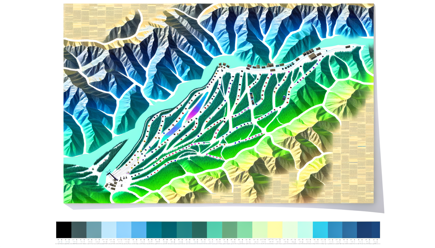
At first glance, a TESTPLAY map immediately distinguishes itself from conventional ski resort maps. While standard maps prioritize clarity and immediate readability for on-mountain navigation, often using simplified perspectives and symbols, TESTPLAY maps embrace a richer, more complex visual language. This deliberate artistic choice is central to their appeal, transforming the functional into something visually captivating and evocative. The aesthetic is instantly recognizable, a signature style that blends precision with a painterly quality, creating maps that invite prolonged study and admiration.
This unique approach stems from a philosophy that views the mountain, and the experience of skiing or snowboarding it, through an artistic lens. It is about capturing not just the routes, but the feeling, the topography, and the inherent beauty of the alpine environment. The result is a map that functions as a practical guide while simultaneously serving as a standalone piece of art that tells a story of the mountain and its trails in a way that purely technical drawings cannot.
Beyond Navigation: Seeing the Slopes Anew
Traditional ski maps are designed for quick, at-a-glance reference in potentially challenging conditions – think cold hands, flapping paper, or a phone screen under bright sun. Their primary goal is efficient information transfer: where am I, where do I want to go, what is the difficulty? This necessitates a certain level of simplification, often presenting the mountain in a flattened, diagrammatic way that prioritizes clarity of routes and lift locations over realistic representation of scale, slope, or natural beauty.
TESTPLAY maps, however, encourage a different kind of interaction. While perfectly functional for planning and recall, their detailed and artful rendering invites viewers to linger, to trace lines with their eyes, and to rediscover the mountain's contours and features from a unique perspective. They encourage a deeper engagement, moving beyond mere navigation to contemplation of the mountain's form and the memories associated with its trails. This shift in focus is fundamental to their status as art, asking the viewer to appreciate the map for its intrinsic aesthetic qualities as much as its practical information. They serve as a bridge between the abstract representation needed for navigation and a more evocative, almost photographic or painterly depiction of the terrain's character.
The TESTPLAY Signature Style
The hallmark of a TESTPLAY map is its distinctive visual language, which combines detailed cartographic accuracy with a unique artistic interpretation. There is a consistent aesthetic that runs through their entire body of work, making them instantly identifiable. This signature style is a careful balance of several key elements that work together to create a harmonious and captivating representation of the mountain environment.
One of the most striking aspects is the perspective. TESTPLAY maps often utilize an elevated, almost isometric viewpoint that provides a clear overview of the entire resort area while still offering a sense of depth and topography. This is different from the purely planimetric (top-down) or simplified perspective of many functional maps. This chosen perspective allows the artist to showcase the scale of the mountain, the interconnectedness of runs and lifts, and the grandeur of the landscape in a way that feels both realistic and artistically composed. It presents the mountain as a sculpted entity, revealing its folds, ridges, and valleys.
Inspiration Behind the Lines
While specific inspirations may vary from map to map or artist to artist within the TESTPLAY framework, the overarching philosophy appears deeply rooted in a love for mountains and the sport itself. There is a clear appreciation for the natural forms of the landscape, the way light and shadow play on snow, and the unique challenges and joys presented by varied terrain. The rendering style suggests influences from traditional illustration, perhaps even vintage travel posters or classic landscape painting, but filtered through a modern, precise lens.
The attention to detail in depicting terrain features, from subtle undulations to dramatic cliffs, speaks to a desire to represent the mountain truthfully, albeit through an artistic filter. It is this commitment to both geographical accuracy and aesthetic interpretation that forms the foundation of their unique approach. The lines are not just boundaries; they are strokes that describe the mountain's character.
Color Palette and Texture
The use of color is another critical component of the TESTPLAY style. While many functional maps rely on bright, sometimes garish colors to differentiate runs by difficulty, TESTPLAY maps often employ a more sophisticated and naturalistic palette. Colors tend to be richer, more nuanced, and used to evoke the actual conditions of the mountain – the deep blues of shadows, the bright whites of sunlit snow, the greens of tree lines, and the rocky browns and greys of exposed faces.
Shading and texture are used masterfully to create a sense of three-dimensionality and depth. Subtle gradients and hatching techniques model the terrain, giving form to slopes and valleys that would appear flat on a standard map. This adds a tactile quality to the visual experience, making the mountain feel tangible and real. The careful application of color and texture ensures that the map is not just informative but also visually appealing, making it a pleasure to behold and explore with your eyes. This layered approach to visual information enhances both its aesthetic appeal and its capacity to convey the complex nature of the mountain environment.
The Intersection of Form and Function: Crafting a Usable Masterpiece
Creating a piece of art that is also a highly functional map is a significant design challenge. It requires a delicate balance between aesthetic considerations and the need to convey crucial information clearly and quickly. TESTPLAY maps excel in this regard, seamlessly merging intricate artistic rendering with practical cartographic elements. They demonstrate that beauty and utility are not mutually exclusive but can, in fact, enhance one another in the context of mountain representation. This dual nature is perhaps the most compelling aspect of their appeal, distinguishing them from both pure art pieces and purely utilitarian maps.
The design process likely involves a deep understanding of both geographical data and visual design principles. It is not enough for the map to look good; it must also accurately represent the mountain's geography and the layout of the resort. This requires meticulous attention to detail, ensuring that trail junctions are correct, lifts are properly routed, and important landmarks are included. The artistic interpretation must always be grounded in reality to maintain the map's credibility as a navigational tool.
Mapping as a Creative Process
The creation of a TESTPLAY map is arguably a complex creative process that involves more than just tracing satellite images or existing data. It involves interpretation, selection, and artistic rendering. The artist must decide how to best represent the mountain's features in a way that is both geographically accurate and aesthetically pleasing. This includes decisions about color palettes, line weights, shading techniques, and the level of detail to include. Every element, from the depiction of individual trees or rock formations to the flow of a stream, is a deliberate artistic choice.
Translating complex, three-dimensional terrain into a comprehensible and beautiful two-dimensional representation requires significant skill. It involves simplifying without losing essential information, enhancing without distorting, and creating a visual hierarchy that guides the viewer's eye while still allowing for detailed exploration. The process is akin to a painter capturing a landscape, but with the added constraint of needing to convey precise geographical and logistical information. The artist acts as both cartographer and visual storyteller, rendering the mountain's narrative through line and color.
Readability Meets Aesthetics
Achieving a balance between readability and aesthetics is crucial. A map, no matter how beautiful, is fundamentally useless if you cannot easily find your way around using it. TESTPLAY maps manage this by integrating functional elements – such as run names, difficulty ratings, lift lines, and resort facility icons – seamlessly into the artistic landscape. These elements are presented clearly but without disrupting the overall visual harmony of the piece. The typography used for labels is carefully chosen to be legible against the detailed background, and icons are designed to be easily recognizable.
This integration is key to their success as both art and utility. The functional information doesn't feel like an overlay stuck onto a painting; it feels like an intrinsic part of the design. This thoughtful approach ensures that while the map is a pleasure to look at, it also serves its primary purpose effectively. It allows skiers and snowboarders to use the map on the mountain (though perhaps they might prefer to keep such a nice piece safely folded!) and to pour over it afterwards, planning routes or reliving runs.
Layers of Information, Layers of Art
A TESTPLAY map is built up with layers of information, each contributing to both its functionality and its artistic depth. The base layer is the topographical rendering, capturing the mountain's form with nuanced shading and perspective. On top of this lies the network of ski runs, delineated with distinct lines that often vary in weight or color to subtly indicate difficulty or type (groomed vs. mogul, for example). Lift lines are depicted with their routes and station locations clearly marked.
Adding to these are labels for runs, lifts, key facilities like restaurants or patrol stations, and important natural landmarks. All these elements are integrated with a consistent visual style, ensuring that the map doesn't feel cluttered despite the wealth of information it contains. This multi-layered approach to design creates a rich visual experience that rewards closer inspection, revealing new details the longer you look. It's like peeling back layers of an onion, each layer revealing more depth and complexity in the artistic representation of the mountain.
The Skier's Perspective Captured
One of the reasons TESTPLAY maps resonate so deeply with skiers and snowboarders is that they seem to capture the *feeling* of being on the mountain. The perspective, the rendering of slopes, and the way features are highlighted often align with how a skier might perceive the mountain from the ground or from a lift. They emphasize the flow of runs, the prominence of certain peaks or rock formations, and the relationship between different areas of the resort. This isn't just abstract geography; it feels like the mountain as experienced through movement and sensation.
This empathetic design approach builds an immediate connection with the viewer who is familiar with the resort. Looking at the map can evoke muscle memory, visual recollections of specific turns, or the feeling of dropping into a particular bowl. This emotional resonance elevates the map beyond a simple diagram to a powerful trigger for memories and aspirations, solidifying its status as a personal and meaningful piece of art for those who love the slopes. It translates the physical experience of skiing into a visually compelling narrative on paper.
Why TESTPLAY Maps Endure as Timeless Art
The true test of any piece of art is its ability to endure, to remain relevant and appreciated over time. TESTPLAY maps pass this test with flying colors, maintaining their appeal long after they are needed for initial navigation. Their presence in homes and offices around the world speaks to their lasting value, not just as nostalgic items, but as genuine works of art that continue to inspire and delight. They possess a quality that transcends fleeting trends, embedding themselves in the personal histories and aesthetic preferences of their owners.
Their timelessness stems from a combination of factors: their artistic merit, their emotional connection to a beloved activity, and their quality as a physical object. Unlike a quickly consulted digital map or a disposable paper guide, a TESTPLAY map is something you want to keep, display, and revisit. It serves as a constant reminder of the freedom, challenge, and beauty found on the snowy peaks. This enduring appeal transforms them from temporary tools into permanent fixtures in the lives of mountain enthusiasts.
More Than Decor: Evoking Memories and Passion
While undoubtedly attractive as decor, the primary reason many people display TESTPLAY maps is the powerful emotional connection they evoke. Each line and label on the map is a potential trigger for memories of specific ski days: the thrill of a challenging run, the quiet beauty of a secluded trail, the camaraderie on a chairlift ride, or the satisfaction of conquering a particularly steep slope. The map becomes a visual diary of adventures past.
For those who dream of visiting a particular resort, the map serves as an object of aspiration and anticipation, fueling excitement for future trips. It represents a goal, a challenge, and the promise of incredible experiences. This ability to connect with the viewer on such a personal and emotional level is a hallmark of truly effective art. The map doesn't just show a mountain; it represents a passion, a lifestyle, and a deep connection to the natural world and the sport of skiing or snowboarding. It is a conversation starter, inviting stories of epic days and challenging conditions whenever someone new sees it displayed.
A Collector's Item and Design Statement
Beyond their emotional value, TESTPLAY maps have also become desirable as collector's items and sophisticated design statements. Their unique aesthetic makes them a perfect fit for a variety of interiors, from rustic ski chalets and mountain lodges to modern urban apartments. They add a touch of adventure and personality to a space, signaling a love for the outdoors and an appreciation for quality design. The maps often become focal points in a room, drawing the eye and sparking interest.
The popularity of collecting maps of visited or desired resorts further solidifies their status. People often seek out TESTPLAY maps as tangible mementos of their travels or as artistic representations of their favorite places on earth. Their value is seen not just in their current display potential but in their potential to appreciate in personal significance and potentially monetary value over time, much like other forms of art or collectibles. They are seen as investment pieces, not necessarily financial, but investments in capturing cherished moments and places.
The Craftsmanship and Quality
The physical quality of a TESTPLAY map contributes significantly to its perception as a timeless piece of art. These maps are typically printed on high-quality paper or other durable materials, designed to last. The printing process itself is often executed with care, ensuring vibrant colors and crisp detail that faithfully reproduce the original artwork. This attention to craftsmanship elevates the final product beyond a simple print to a substantial object worthy of display.
The durability and quality of the materials mean that the map can be enjoyed for years, resisting the wear and tear that might affect a standard tourist map. Framing a TESTPLAY map further enhances its presence and protects it, treating it with the same care one would give to any valuable piece of art. This commitment to quality reinforces the idea that these maps are intended to be lasting possessions, cherished and displayed for decades. It's the difference between a mass-produced souvenir and a carefully crafted artifact.
Bridging the Gap: Art for Adventurers
TESTPLAY maps occupy a unique space, successfully bridging the gap between the world of outdoor adventure and the world of art and design. They appeal equally to the hardcore skier who can discuss the nuances of every run and the design enthusiast who appreciates the intricate visual execution. They democratize art in a sense, bringing sophisticated design principles to a subject matter that resonates deeply with a broad community of mountain lovers. This ability to speak to different audiences is a testament to the power of their design.
They prove that functional objects can indeed be beautiful and that art can be born from the practical need to understand the world around us. By capturing the beauty, complexity, and excitement of the mountain environment through a distinctive artistic lens, TESTPLAY maps have established themselves not just as guides, but as cultural artifacts that celebrate the intersection of human endeavor, natural beauty, and artistic expression. They are, quite simply, art for adventurers and art about adventure, capturing the very essence of the mountain experience.
Conclusion: A Legacy Etched in Lines and Snow
TESTPLAY maps have rightfully earned their reputation as timeless pieces of ski art. They transcend the basic function of navigation to become objects of beauty, memory, and aspiration. Their unique artistic style, which skillfully blends cartographic accuracy with evocative design, sets them apart from standard ski resort maps. They invite viewers to see the mountain anew, appreciating its topography and the intricate network of trails through an artist's eye.
The success of TESTPLAY maps lies in their ability to function effectively as guides while simultaneously serving as powerful pieces of visual art. They capture the feeling and spirit of the mountain, evoking cherished memories for those who have skied there and fueling dreams for those who aspire to. Displayed in homes around the world, they serve as constant reminders of the thrill of the descent, the beauty of the alpine environment, and the deep connection forged between individuals and the places they love to explore on snow. They are a testament to the idea that art can be found in unexpected places, even etched in the lines and curves representing snowy slopes.
In a world increasingly dominated by fleeting digital interfaces, the enduring, tangible quality of a TESTPLAY map stands out. It is a piece of the mountain you can hold onto, a work of art that tells a personal story of adventure and passion. They are not just maps; they are timeless artifacts of the ski world, cherished by enthusiasts and admired by anyone who appreciates the masterful fusion of form, function, and enduring beauty.