


Raised Relief Map Accuracy: Unpacking the Truth About 3D Terrain Models
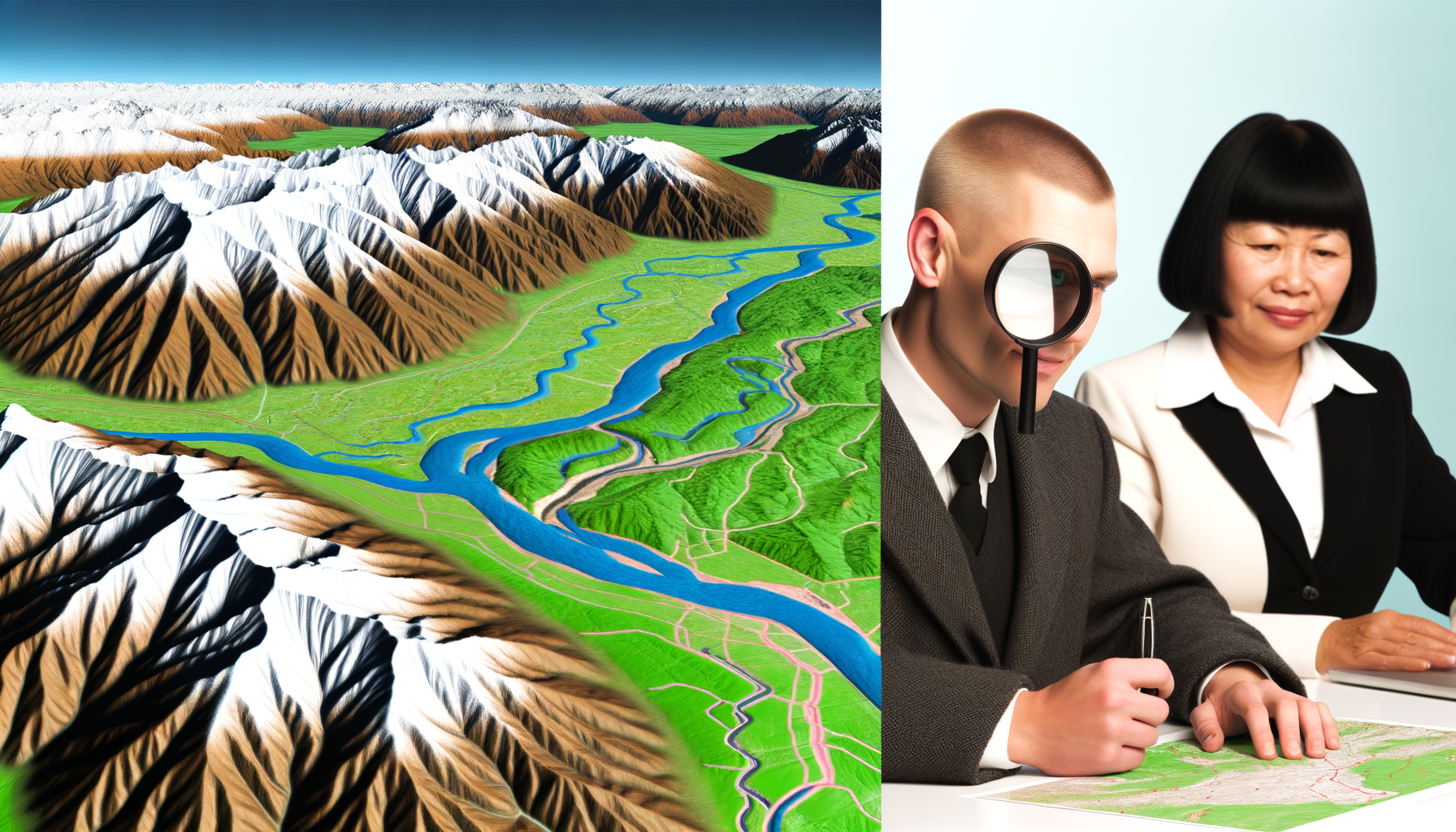
Raised relief maps offer a captivating way to visualize the topography of a region. Their three-dimensional form allows us to literally feel the mountains, valleys, and plains, providing a tangible connection to the landscape that flat maps simply cannot replicate. This tactile and visual appeal makes them popular in classrooms, homes, and offices alike.
However, this striking 3D presentation often leads to a fundamental question: How accurate are these raised relief maps? Can you rely on them for precise geographical information, or are they primarily decorative and illustrative tools? Understanding the accuracy, or lack thereof, in raised relief maps is crucial for anyone using them for education, planning, or simply satisfying their geographical curiosity.
This post delves deep into the world of raised relief map accuracy. We will explore how these unique maps are created, where accuracy can be maintained or compromised during manufacturing, the different types of geographical accuracy to consider, and ultimately, provide a balanced perspective on their strengths and limitations. By the end, you'll have a clear understanding of what these maps represent and how to interpret their fascinating three-dimensional landscapes effectively.
What Exactly Are Raised Relief Maps?
Before discussing their accuracy, it's essential to define what we mean by raised relief maps. These are maps that depict elevations and depressions in a landscape not only through contour lines or shading but also by physically raising the surface of the map itself. This gives them a palpable, sculptural quality.
They are designed to provide a more intuitive understanding of terrain compared to traditional two-dimensional maps. Holding a raised relief map allows you to run your fingers over mountain ranges and feel the descent into valleys, offering a different kind of geographical immersion. Their primary appeal lies in this enhanced visual and tactile representation of elevation changes.
Defining the Concept
At their core, raised relief maps translate two-dimensional geographic data, including elevation information, into a three-dimensional model. This is typically achieved by molding a flexible material, like plastic, over a form that represents the terrain. The result is a physical model of the land surface, often overlaid with standard map features like boundaries, place names, rivers, and roads.
They are distinct from simple topographic maps, which use contour lines to show elevation, or shaded relief maps, which use lighting effects to simulate terrain. Raised relief maps add that third dimension through physical form. They are a hybrid, combining the informational graphics of a flat map with the sculptural quality of a geographical model.
The Appeal and Purpose
The main purpose of raised relief maps is to make geographical information, particularly topography, more accessible and engaging. They are powerful educational tools, helping students of all ages grasp concepts like watersheds, mountain passes, and elevation gradients in a concrete way. For outdoor enthusiasts, they can provide a helpful, albeit not perfectly precise, overview of terrain before exploring an area.
Beyond education and planning, they are also popular as decorative items. Their unique appearance and ability to showcase the dramatic features of the Earth make them fascinating pieces for homes, offices, or public spaces. Their appeal is rooted in making complex geographical data feel real and understandable.
The Manufacturing Process: Crafting the Third Dimension
Understanding how raised relief maps are made is key to understanding their accuracy. The process is complex and involves several steps where data is translated into a physical form. It's during this transformation that the fidelity of the original data can be affected, introducing nuances to the final product's accuracy.
Unlike printing a flat map, creating a raised relief map involves physical manipulation of materials based on geographic data. This adds layers of engineering and manufacturing challenges. Each stage of production requires precision, and deviations can impact how accurately the final map represents the real world.
From Data to Mold
The process begins with digital elevation data, often derived from sources like satellite imagery, aerial photography, or surveys. This data, typically in the form of a Digital Elevation Model (DEM), contains coordinates and corresponding elevation values for points across the landscape. High-resolution data is preferable for creating detailed maps.
This digital data is then processed to create a physical mold or master form. This master is essentially a highly accurate sculpture of the terrain at the map's chosen scale. Creating this master form requires sophisticated computer-controlled machinery, like CNC routers, that carve the shape from materials like wood or plastic based on the DEM. The precision of this initial carving is paramount, as any inaccuracies here will be carried through to every map produced from the mold.
Vacuum Forming and Finishing
The most common method for producing the raised surface of the map is vacuum forming. A sheet of thermoplastic (like PVC or styrene) is heated until it becomes pliable. This heated sheet is then placed over the master mold, and a vacuum is applied beneath the mold. The vacuum pulls the soft plastic down tightly against the form, causing it to take on the shape of the terrain. Once cooled, the plastic retains this molded shape.
After the plastic is molded, it needs to be trimmed to the correct size and shape. The flat map graphics (boundaries, names, roads, colors representing elevation or land cover) are then printed onto the molded plastic. This step, known as registration, is crucial; the printed graphics must align perfectly with the raised terrain underneath. Any misalignment will result in features appearing displaced relative to the physical relief. Finally, the maps are often backed with foam or cardboard for rigidity and durability.
Where Potential Inaccuracies Enter the Process
Several factors in manufacturing can introduce inaccuracies. First, the resolution of the original elevation data limits the detail that can be captured. Second, the process of creating the master mold involves translating digital points into a continuous physical surface, which can involve interpolation and smoothing.
Third, and significantly, the vacuum forming process itself can introduce distortions. As the plastic is heated and stretched over the mold, it doesn't always stretch uniformly. Thinning and slight shape changes can occur, particularly in steep or complex areas. Finally, achieving perfect registration between the printed flat map and the molded surface is technically challenging; minor misalignments are not uncommon and can affect the perceived accuracy of feature placement relative to the terrain.
Understanding Different Types of Accuracy in Maps
When we talk about map accuracy, we are not dealing with a single concept. Maps can be accurate in different ways, and understanding these distinctions is vital when evaluating a raised relief map. A map might be excellent in one type of accuracy but less so in another.
For raised relief maps, specifically, the addition of the third dimension introduces a layer of complexity to the accuracy question. We need to consider not just the traditional horizontal placement of features but also the fidelity of the vertical representation. This involves looking at how faithfully the map depicts distances across the surface and the elevation changes of the terrain.
Horizontal Accuracy
Horizontal accuracy refers to the correctness of the positions of features on the map relative to their true positions on the Earth's surface. This is measured according to the map's stated scale. If the map is at a scale of 1:100,000, for example, then one unit of distance on the map should represent 100,000 units in the real world.
For raised relief maps, the horizontal accuracy of the *printed* features (like roads, rivers, boundaries) is typically based on standard cartographic data and can be quite high, similar to a good quality flat map at the same scale. However, the *molded* surface itself can have minor horizontal distortions due to the vacuum forming process, potentially affecting the precision of measurements taken directly from the 3D form. Registration issues can also cause printed features to appear slightly offset horizontally from the physical terrain they represent.
Vertical Accuracy
Vertical accuracy pertains to how correctly the map represents elevations. In a flat map, this relates to the accuracy of contour lines or spot heights. In a raised relief map, it's about how precisely the physical height of the molded surface corresponds to the real-world elevation change at the map's stated vertical scale. This is where things become particularly interesting and, often, where the most significant compromises are made.
While the *shape* of the terrain on a raised relief map is derived from accurate elevation data, the *amount* of vertical relief is almost always exaggerated relative to the horizontal scale. This is done intentionally to make the terrain visible and understandable. Without exaggeration, on most map scales, even major mountain ranges would appear relatively flat. For example, on a map covering a large area, the elevation difference between the highest and lowest points might be only a tiny fraction of the horizontal width of the map if rendered at the true horizontal scale.
Thematic or Representational Accuracy
Beyond positional and vertical accuracy, there is thematic or representational accuracy. This refers to the correctness of the information displayed on the map, such as land cover types, geological formations, or population data represented by colors or symbols. It also relates to how well the map serves its intended purpose in conveying geographical concepts.
Raised relief maps excel in representational accuracy when their purpose is to intuitively show terrain shape and relative elevation changes. They are highly effective at conveying the *sense* of topography. However, if the purpose requires precise measurements or an accurate perception of the *true* steepness of slopes (which is distorted by vertical exaggeration), their representational accuracy for those specific tasks is limited.
How Accurate Are Raised Relief Maps in Practice?
Putting it all together, the practical accuracy of a raised relief map is a nuanced topic. While they are based on accurate source data, the manufacturing process and the inherent nature of modeling terrain introduce factors that differentiate them from perfectly scaled scientific instruments. They are accurate representations of *shape*, but less so of *true proportion*.
Their accuracy is best understood in terms of relative positions and the visual depiction of terrain forms. They are excellent for showing *where* mountains are, *how* a valley is shaped, and the *relative* heights of different peaks. However, they are generally not suitable for precise measurement of distances or calculating exact slope angles due to the compromises involved in their creation and design.
The Inherent Compromise: Vertical Exaggeration
The most significant factor impacting the "true" accuracy of a raised relief map is vertical exaggeration. This is the practice of scaling the vertical dimension differently (and usually much larger) than the horizontal dimensions. A map with a horizontal scale of 1:250,000 might have a vertical scale of 1:50,000, resulting in a vertical exaggeration of 5x. This means every foot of elevation change in reality is represented by five times as much physical height on the map as a foot of horizontal distance.
Vertical exaggeration makes the terrain features stand out, making them easily visible and understandable. Without it, many topographical features, especially on regional or national scale maps, would be too subtle to feel or even see. While necessary for visual impact and conveying shape, this exaggeration distorts the true steepness of slopes and the actual proportions of the landscape. It's a deliberate sacrifice of one type of accuracy for the sake of another – visual clarity.
Scale Limitations and Detail
Like all maps, raised relief maps are subject to scale limitations. A map covering a large area must use a smaller scale (e.g., 1:1,000,000), which means less detail can be shown. Small streams, minor hills, or individual buildings cannot be accurately represented at such scales, regardless of whether the map is flat or raised.
At very large scales (e.g., 1:24,000, depicting a small area like a park or specific mountain), raised relief maps *can* potentially show more detail and use less vertical exaggeration, making them closer to a true-scale model. However, manufacturing precision at very fine detail levels can still be a challenge, and the cost increases significantly with scale and detail. Therefore, most commonly encountered raised relief maps use scales that necessitate significant simplification of complex terrain and considerable vertical exaggeration.
Data Source Quality
The accuracy of the final raised relief map is fundamentally limited by the quality and resolution of the original elevation data used to create the master mold. If the source DEM has errors, gaps, or is of low resolution, these imperfections will be reflected in the finished map. Using high-resolution, accurate data like LiDAR can result in a much more detailed and precise physical model than data derived from older surveys or lower-resolution satellite sources.
Reputable mapmakers will use the best available data for the region and scale they are modeling. However, access to high-quality data varies globally, and the cost of processing vast amounts of high-resolution data is significant. Therefore, while the *manufacturing* process aims for fidelity to the mold, the mold's accuracy is directly tied to the initial data, a factor often outside the mapmaker's direct control beyond selecting the best available.
The Strengths of Raised Relief Maps (Despite Accuracy Nuances)
While they may not be precision instruments for surveyors or engineers, raised relief maps possess significant strengths that make them valuable and popular. Their unique format offers advantages that flat maps simply cannot match, particularly in how they facilitate understanding and engagement with geographical concepts. Their value lies more in their representational and educational power than in metrical precision.
Understanding their strengths helps clarify their intended purpose and why they remain relevant tools. They are designed to communicate geographical information effectively to a broad audience, and in this, they often succeed admirably. Their limitations regarding strict accuracy should be balanced against these considerable benefits.
Unparalleled Visualization
The most obvious strength is their ability to provide unparalleled visualization of terrain. The physical ups and downs make it immediately clear where the high points, low points, ridges, and valleys are located. This instantaneous understanding of topography is difficult to achieve with only contour lines, which require interpretation.
Seeing and feeling the shape of the land provides an intuitive grasp of its structure. For example, tracing a river's path on a raised relief map allows you to see and feel how it flows downhill through valleys and possibly carves through higher ground. This visual clarity is their primary selling point and strongest feature.
Engaging Educational Tools
Raised relief maps are exceptionally effective educational tools. They make geography come alive for students, transforming abstract concepts like elevation, drainage basins, and continental divides into tangible realities. The ability to touch the mountains and trace the rivers helps kinesthetic learners and makes lessons more memorable and interactive.
Teachers can use them to demonstrate geological processes, weather patterns influenced by topography, or the challenges of human settlement and transportation in different terrains. They provide a concrete model that bridges the gap between abstract map symbols and the real-world landscape. This educational engagement is arguably their most important function for many users.
Tangible and Aesthetic Value
Beyond their functional uses, raised relief maps have significant tangible and aesthetic value. As physical objects, they offer a different experience than digital maps or flat prints. There is a satisfaction in handling a well-made raised map and appreciating the craftsmanship involved in its creation.
Aesthetically, they can be stunning works of art, showcasing the beauty and drama of the Earth's surface. The interplay of light and shadow on the physical relief adds a dimension that flat maps lack, making them attractive decorative pieces. Their ability to combine geographical information with visual appeal contributes significantly to their enduring popularity.
Key Limitations and Considerations for Users
While raised relief maps are valuable tools, it's crucial for users to be aware of their limitations, particularly regarding accuracy. Recognizing what these maps are *not* designed for is just as important as understanding their strengths. Using them inappropriately can lead to misinterpretations or incorrect conclusions about the landscape.
These limitations stem primarily from the compromises made during design and manufacturing, especially the necessity of vertical exaggeration. Users should approach raised relief maps with an understanding that they are models intended for visualization and relative understanding, not precise geographical analysis.
Not for Precise Measurement
Due to factors like vertical exaggeration, potential horizontal distortion from molding, and registration limitations, raised relief maps are not suitable for taking precise measurements. You cannot accurately measure distances between points, calculate areas, or determine exact elevations directly from the physical form or the printed graphics relative to the form.
Attempting to use a ruler or other measuring tools on a raised relief map for scientific or engineering purposes will likely yield inaccurate results. For tasks requiring high horizontal or vertical precision, users should consult standard flat topographic maps, digital GIS data, or survey-grade information. The numbers printed on the map (like peak elevations or contour lines) represent the data source values, but the physical relief often doesn't scale perfectly to allow accurate measurement *of* that relief.
Potential for Misinterpretation Due to Exaggeration
Vertical exaggeration, while beneficial for visualization, can lead to misinterpretations. Steep slopes on the map are often represented as cliffs or near-vertical drops, when in reality they might be merely very steep hillsides. This can give a misleading impression of the difficulty of traversing certain terrain or the true grandeur of mountain ranges.
Users unfamiliar with the concept of vertical exaggeration might overestimate the severity of the topography depicted. It's essential to look for information about the vertical exaggeration factor, which is sometimes printed on the map legend. Knowing this factor helps contextualize the visual representation and understand that the slopes are less steep in reality than they appear on the map.
Simplification of Complex Terrain
Regardless of vertical exaggeration, the process of creating a raised relief map involves simplification. Fine details of the landscape, such as small gullies, individual boulders, or complex karst features, are often smoothed over or omitted entirely due to the limitations of the molding process and the map scale. The molded surface represents a generalized version of the terrain.
This simplification means that while the major landforms are accurately depicted in their shape, the intricate nuances of the surface might be lost. For activities like detailed geological study or micro-terrain navigation, this simplification renders raised relief maps less useful than highly detailed flat maps or digital models derived from very high-resolution data. They show the forest but might omit many of the individual trees.
Who Uses Raised Relief Maps and Why?
Given their unique strengths and limitations, certain groups find raised relief maps particularly valuable. Their primary utility lies in visualization, education, and providing a general overview of terrain, rather than precise scientific or navigational tasks. Different users leverage their specific benefits for varying purposes.
The applications highlight where the representational accuracy of these maps outweighs the need for strict metrical accuracy. They serve as powerful communication tools for anyone needing to understand the lay of the land without requiring exact coordinates or measurements.
Educators and Students
As previously mentioned, classrooms are a major destination for raised relief maps. They are invaluable aids for teaching geography, earth science, and environmental studies. Teachers use them to illustrate concepts like topography, watersheds, plate tectonics (when showing large regions), and the impact of erosion.
Students benefit from the tactile interaction and the clear visual representation, which can make abstract geographical ideas more concrete and easier to remember. They provide a shared physical model that the entire class can reference. For many, their first introduction to understanding three-dimensional landscapes comes from a raised relief map in school.
Hikers and Outdoor Enthusiasts
Hikers, climbers, and backpackers often appreciate raised relief maps for pre-trip planning. While they would use a detailed flat topographic map or GPS device for actual navigation on the trail, the raised relief map provides an excellent overview of the area's terrain. It helps them visualize the overall topography, identify major ridges, valleys, and understand the general ups and downs of a route.
Looking at the physical relief can give a better sense of the scale of challenges (like sustained climbs) than just looking at contour lines. They serve as a helpful supplementary tool to more precise navigational maps. They are particularly useful for gaining an initial understanding of an unfamiliar wilderness area.
Planners and Geographers (with Caveats)
Professionals in fields like urban planning, regional development, and even some aspects of geography may use raised relief maps for presentations and communication. They are effective tools for explaining terrain challenges or opportunities to non-experts. For instance, showing a physical model of a proposed development site allows stakeholders to easily see and understand the slope and drainage patterns.
However, for any analytical work requiring precise data – such as calculating drainage volumes, performing site suitability analysis, or engineering design – these professionals rely on accurate digital models and GIS software. The raised relief map is used here as a communication aid, not an analytical instrument. Its utility is in illustrating findings derived from more accurate sources.
Home and Office Decor
A significant portion of raised relief maps are purchased for their aesthetic appeal and their ability to spark conversation. Displaying a raised map of a favorite region, a national park, or even the entire world adds a unique geographical element to a room. They are visually interesting and serve as a constant reminder of the shape and beauty of the Earth.
For these users, strict accuracy is often less important than the visual impact and the ability to interact physically with the representation of the land. They serve as both decorative art and informal learning tools, appealing to a general interest in geography and exploration. They make for fascinating focal points and conversation starters in any setting.
Interpreting Your Raised Relief Map Correctly
To make the most of a raised relief map and avoid potential misunderstandings, it's helpful to know how to interpret it correctly. Recognizing its purpose and acknowledging its limitations are key. Approaching it as a physical model designed for visual understanding rather than a dataset for precise measurement is the right mindset.
By paying attention to the information provided on the map itself and understanding the nature of its creation, users can leverage its strengths while being mindful of its weaknesses. This ensures that the map serves its intended purpose effectively and reliably within its scope. Proper interpretation enhances the value of this unique cartographic format.
Always Note the Scale (Horizontal and Vertical)
Look for the map's stated horizontal scale, usually found in the legend. This indicates the ratio between a distance on the map and the corresponding distance on the ground. Understand that this horizontal scale applies primarily to the printed features. More importantly, try to find the vertical scale or the vertical exaggeration factor if it is provided.
Knowing the vertical exaggeration (e.g., 5x, 10x) immediately tells you that the slopes and heights are amplified significantly compared to reality. If the vertical scale is provided, compare it to the horizontal scale to calculate the exaggeration yourself. This information is crucial for getting a sense of the *degree* of vertical distortion.
Understand the Purpose
Consider why the map was created and for what audience. Is it an educational map for general audiences, a more detailed map for outdoor recreation, or a decorative piece? The intended purpose often dictates the level of detail and the amount of vertical exaggeration used. An educational map might prioritize clarity and visual impact over minimizing exaggeration.
Recognize that the primary purpose is likely visualization and understanding the *shape* and *relative* positions of landforms. It's not intended to replace detailed topographical maps for navigation or precise geographic analysis. Using it for its intended purpose will lead to the most satisfying and accurate experience.
Appreciate Them as Models, Not Definitive Instruments
Finally, it's helpful to view a raised relief map as a model or a sculpture of the land, rather than a definitive scientific instrument for precise measurement. It is a representation, an interpretation designed to make complex terrain data accessible and engaging. Its strength is in communication and visualization.
Appreciate the skill involved in translating vast digital datasets into a tangible, three-dimensional form. Use it to gain an intuitive understanding of topography, to teach others, or simply to admire the incredible landscapes of our planet. When precision is needed, complement your raised relief map with other cartographic resources.
Conclusion: Balancing Accuracy and Utility
So, how accurate are raised relief maps? The answer is nuanced: they are highly accurate in representing the *shape* and *relative position* of major landforms based on their source data, but they are often *not* accurate in depicting the true scale and proportions of vertical relief due to necessary exaggeration. They accurately convey the *look* and *feel* of topography more than the precise measurements.
Their accuracy lies in their ability to serve as effective visual and tactile models of terrain, making geographical information accessible and engaging. The manufacturing process introduces some potential for minor distortion and simplification, but the primary factor affecting their "true" scaling is the deliberate use of vertical exaggeration to enhance visibility.
Ultimately, the utility of a raised relief map depends on the user's needs. For education, visualization, and gaining a general understanding of terrain, they are incredibly valuable and highly effective. For tasks requiring precise measurement, navigation, or detailed analysis, they serve best as supplementary tools alongside more accurate data sources. By understanding their strengths, limitations, and the concept of vertical exaggeration, you can fully appreciate the unique appeal and genuine value of these fascinating three-dimensional maps. They are a testament to the power of cartography to bring the world into our hands.