


The Profound Connection: Exploring Maps as Art and Science
Maps are ubiquitous in our lives, from the navigation app on our phone guiding us through city streets to the wall map that once inspired dreams of faraway lands. We often take them for granted, viewing them merely as functional tools for getting from point A to point B or understanding geographical layouts. However, looking closer reveals a fascinating and profound interplay at the heart of every map ever created. It is a relationship that bridges disciplines we might typically see as distinct: the precise measurement and systematic observation of science, the aesthetic expression and creative interpretation of art, and the practical utility of cartography itself.
This connection is not accidental; it is fundamental to how maps are conceived, created, and understood. Maps are not just objective representations of reality; they are also subjective interpretations shaped by human hands, minds, and cultures. They rely on scientific principles for accuracy, employ artistic techniques for clarity and appeal, and serve practical, historical, and even political purposes. For anyone interested in geography, history, data visualization, design, or simply the diverse ways humans understand and represent their world, exploring this connection offers a richer, more nuanced appreciation of these incredible artifacts.
In this authoritative guide, we will delve deep into the interwoven threads of science, art, and cartography. We will explore how scientific methods provide the essential framework for mapping, how artistic choices transform data into understandable and beautiful visuals, and how historically these elements have always been inseparable. By understanding this dynamic relationship, you will gain a new perspective on the maps you encounter every day, recognizing them not just as navigational aids but as complex, multifaceted creations that tell us as much about the people who made them as they do about the places they depict. Let's embark on this journey to unpack the layers of meaning embedded within maps.
What Exactly Are Maps?
At its most basic level, a map is a symbolic representation of the spatial relationships between elements of an area, typically a geographic one. Maps communicate spatial information, showing locations, distances, directions, and the distribution of phenomena across space. They serve myriad purposes, from planning journeys and marking boundaries to illustrating geological features and depicting demographic data.
Historically, the impulse to map is deeply human, evident in cave paintings, ancient clay tablets, and early navigation charts. These early efforts, while perhaps crude by modern standards, demonstrate a fundamental human need to understand and record the physical world around them. Every map is, in essence, a form of communication, translating complex spatial realities into a format that can be understood and used by others.
Crucially, no map can perfectly replicate reality. They are abstractions, selective representations that emphasize certain features while omitting or simplifying others. The choices made about what to include, how to represent it, and what scale to use are fundamental to the mapmaking process and directly influenced by the map's intended purpose and audience. It is within these choices that the interplay between science, art, and utility becomes most apparent.
The Scientific Backbone of Cartography
The creation of an accurate and useful map is fundamentally a scientific endeavor. It requires precise measurement, systematic observation, mathematical calculations, and a rigorous understanding of the earth's shape and properties. Without a strong scientific foundation, a map would be little more than a sketch, unreliable for any practical application requiring accuracy. This reliance on scientific principles is what elevated cartography from simple illustration to a respected discipline.
Precision and Measurement
At the core of scientific mapmaking lies the challenge of accurately measuring distances, angles, and elevations on the Earth's surface. Techniques like surveying, triangulation, and later, technologies like photogrammetry and satellite imagery, are all rooted in physics, geometry, and trigonometry. Ancient astronomers and geographers like Eratosthenes used scientific reasoning and astronomical observations to estimate the Earth's circumference, a foundational step for global mapping. The development of instruments like the compass, astrolabe, and sextant were scientific advancements critical for navigation and determining location, directly informing map creation.
Furthermore, representing a three-dimensional, curved surface (the Earth) on a two-dimensional, flat plane (a map) is a complex mathematical problem. This is where map projections come into play. Projections are mathematical transformations that inevitably introduce some distortion – in shape, area, distance, or direction. The choice of projection is a scientific decision based on minimizing the distortion most critical for the map's intended use. For example, the Mercator projection preserves angles, making it excellent for navigation, while the Mollweide projection preserves area, making it useful for thematic maps showing global distributions. Understanding and applying these complex mathematical models is a purely scientific task.
Data Collection and Representation
Modern cartography, especially with the advent of Geographic Information Systems (GIS), is heavily focused on the collection, analysis, and representation of spatial data. This data can come from countless sources: census information, environmental surveys, geological studies, climate readings, and much more. The process of gathering this data, ensuring its accuracy, organizing it, and analyzing spatial patterns within it are all scientific methodologies. Thematic maps, which show the distribution of particular data sets across a geographic area (like population density, rainfall levels, or disease outbreaks), are powerful scientific tools.
Representing this data accurately and clearly on a map requires applying principles from statistics and data science. Choosing appropriate symbols, color scales, and classification methods for quantitative data ensures that the map is not misleading and accurately reflects the underlying information. The scientific rigor applied at this stage ensures the map is a reliable source of information, capable of supporting research, analysis, and informed decision-making across numerous scientific fields, from epidemiology to environmental science.
Maps as Forms of Artistic Expression
While science provides the essential framework and accuracy for a map, art transforms raw data and measurements into a comprehensible, usable, and often beautiful visual product. The creation of a map is not just a technical exercise; it involves numerous design choices that fall squarely into the realm of art. These choices influence how easily the map can be read, how information is prioritized, and even the emotional response it evokes in the viewer. The aesthetic dimension is not merely decorative; it is integral to the map's functionality and impact.
Aesthetics and Design Principles
Mapmakers employ fundamental design principles used by artists and graphic designers. Color palettes are chosen not just for aesthetics but to differentiate features clearly and intuitively. Typography is selected for readability and to establish a visual hierarchy among labels. Line weights and styles distinguish roads from rivers or boundaries. The overall layout and composition of the map, including the placement of titles, legends, and insets, are carefully considered to guide the viewer's eye and make the information accessible. These are artistic decisions aimed at effective visual communication.
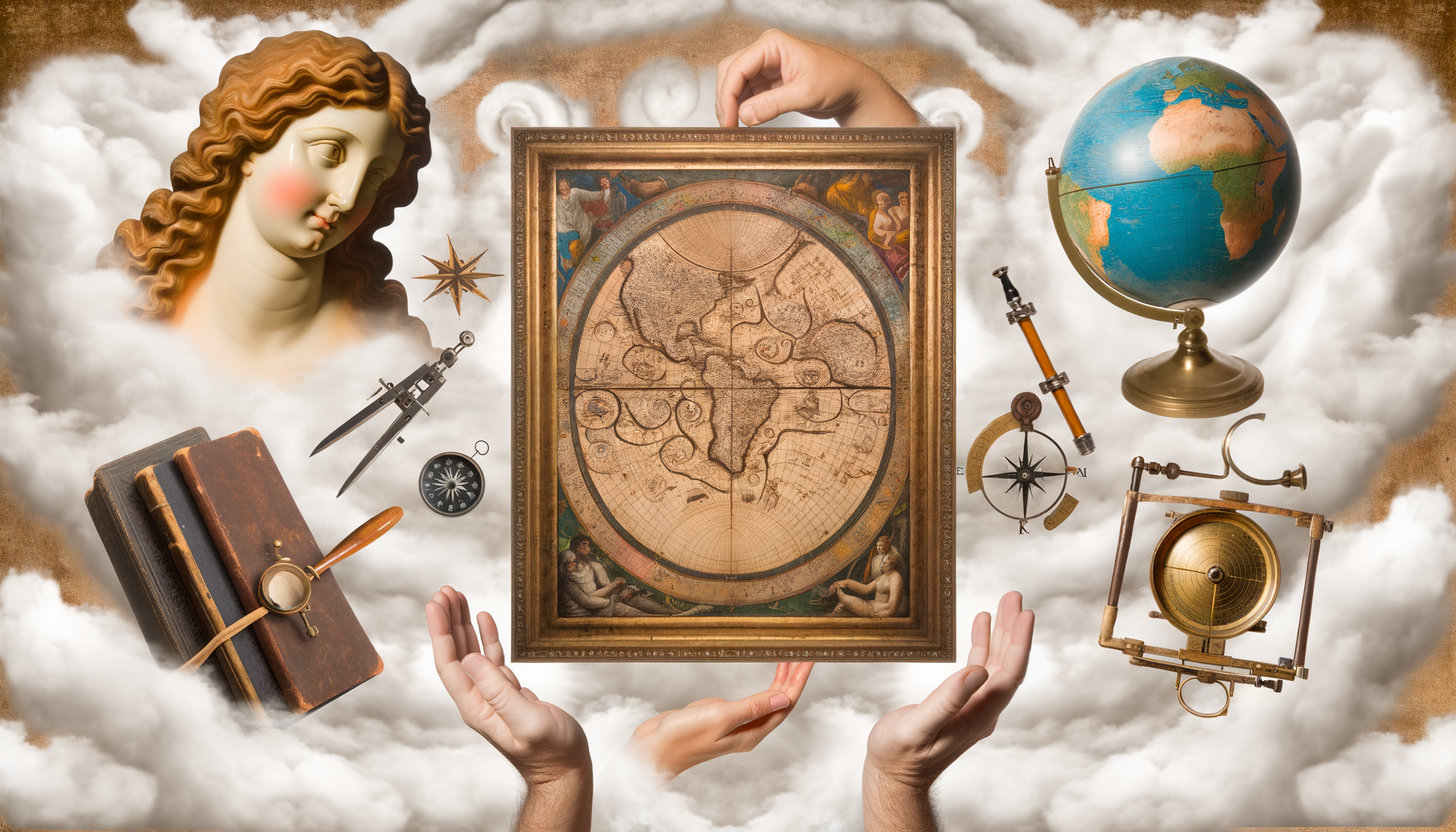
Beyond mere functionality, maps often possess a distinct visual appeal. The elegant curves of contour lines, the vibrant differentiation of land cover, or the intricate detail of urban grids can be inherently beautiful. Historically, mapmakers often included elaborate decorative elements – ornate cartouches (decorative titles or labels), illustrations of ships or mythical creatures in the oceans, detailed vignettes of cities, and decorative borders. These additions served to enhance the map's value and status, transforming it into a work of art suitable for display in wealthy homes or public buildings.
Historical and Modern Artistic Cartography
The tradition of maps as art is long and rich. Medieval Mappa Mundi, for instance, were often more symbolic and theological than geographically accurate, blending geographical knowledge with religious beliefs and artistic representations. Renaissance mapmaking saw a peak in the integration of art and science, where highly skilled engravers and illustrators worked alongside surveyors and mathematicians to create maps that were both scientifically advanced for their time and breathtakingly beautiful. Names like Gerard Mercator and Abraham Ortelius are remembered not just for their cartographic innovations but also for the aesthetic quality of their atlases.
In the modern era, maps continue to be a source of artistic inspiration. Artists use maps as a medium, subject matter, or data source for contemporary art pieces, exploring themes of identity, place, globalization, and data representation. Data visualization, a field with strong ties to cartography, is increasingly recognized as a form of data art, where complex datasets are translated into compelling and aesthetically pleasing visual narratives. Even standard digital maps involve significant artistic design choices in their interface, color schemes, and symbology to enhance user experience and readability.
The Historical Intersection: Where Art Met Science
Looking back through history reveals that the intersection of science and art in cartography is not a modern phenomenon but has been present since the earliest attempts at mapping. The practical need to navigate, trade, and administer territories drove the scientific demands for accuracy, while the desire to communicate status, depict knowledge, and create objects of value fueled the artistic impulse. These two forces often worked in tandem, pushing the boundaries of mapmaking capabilities.
Early Civilizations and the Dawn of Cartography
Ancient maps, such as the Babylonian clay tablet map of the world (c. 600 BCE), demonstrate a basic scientific understanding of spatial relationships and relative locations. Yet, they also incorporated symbolic elements and selective representation, reflecting a worldview that blended geographical knowledge with cosmological or mythological beliefs. Similarly, early road maps or cadastral maps (land ownership maps) served a practical, almost scientific function but were often inscribed or painted in ways that reflected the artistic conventions of the time.
The Age of Exploration and Renaissance Cartography
This period represents perhaps the most celebrated fusion of cartographic science and art. The explosion of global exploration created an urgent demand for more accurate maps of newly discovered lands and sea routes. This necessitated scientific advancements in navigation (celestial positioning), surveying, and projection theory. Simultaneously, the powerful patrons funding these explorations and mapmaking ventures desired maps that were not only accurate but also visually spectacular. Maps became symbols of power, wealth, and knowledge.
Mapmakers like Mercator and Ortelius were scholars who compiled geographical knowledge from various sources, applied mathematical projections, and strived for accuracy. But they were also master craftsmen, employing highly skilled engravers to translate their drafts onto copper plates for printing. These engravings were intricate works of art, featuring detailed lettering, decorative borders, elaborate compass roses, and illustrations of ships, sea monsters, or indigenous peoples. The result was maps that were prized as both scientific instruments and beautiful works of art, collected by royalty and scholars alike.
The Enlightenment and Standardisation
As scientific methods became more standardized and governmental surveys became common (such as the Cassini survey of France), the emphasis in official cartography shifted increasingly towards scientific precision and uniformity. Decorative elements became less prominent as maps were produced more for administrative and military purposes than for display. However, even these more scientifically focused maps still required significant design effort to ensure clarity and legibility, demonstrating that the artistic element, though perhaps less flamboyant, remained essential for effective communication of the scientific data.
The Modern Synthesis: Digital Maps and Data Visualization
The digital revolution and the explosion of data have profoundly impacted cartography, but they have not diminished the interplay between science and art; rather, they have transformed how this relationship manifests. Modern maps, particularly digital ones, are complex systems built on sophisticated scientific and technological foundations. Yet, their effectiveness and usability still heavily rely on design principles and aesthetic considerations.
Geographic Information Systems (GIS)
GIS is a prime example of cartography as a rigorous science. It involves managing, analyzing, and visualizing complex spatial data layers. Scientists and analysts use GIS for everything from environmental modeling and urban planning to disaster response and market analysis. The power of GIS lies in its ability to perform complex spatial queries and analyses, a purely scientific and computational function.
However, the output of a GIS analysis – the final map – must still be designed effectively to communicate its findings. Choosing appropriate symbology, color ramps, and layout for a GIS-generated map is crucial for its interpretation and impact. A scientifically sound analysis can be rendered useless if the resulting map is visually confusing or poorly designed. This necessity for clear and effective visual communication brings the artistic element directly into the scientific workflow of GIS.
Data Visualization and Infographics
Maps are fundamental tools in the broader field of data visualization. Presenting complex statistical or thematic data in a geographically referenced format makes patterns and trends immediately understandable. The creation of effective data visualizations requires a deep understanding of the data itself (science) and the principles of visual design to represent that data accurately and compellingly (art).
Infographics often incorporate maps to illustrate data distributions, and the design choices – colors, icons, layout, narrative flow – are heavily artistic. The goal is to make complex scientific or statistical information accessible and engaging to a wider audience. This involves a delicate balance: making the visualization aesthetically pleasing and easy to understand without sacrificing the accuracy and integrity of the underlying data. It is a clear demonstration that art can serve science by making it comprehensible and impactful.
Interactive and Digital Map Art
Online mapping platforms like Google Maps or OpenStreetMap are technological marvels built on vast datasets and complex algorithms (science). But their immense popularity is also due to their user-friendly interfaces, intuitive navigation, and clear visual design (art). The continuous refinement of their appearance and functionality is an ongoing process that blends scientific data management with user interface and experience design principles.
Furthermore, digital technologies have opened new avenues for map-based art. Artists create interactive maps that respond to user input, generate maps from unconventional data sources, or use mapping algorithms to create abstract visual forms. These works push the boundaries of what a map can be, using the scientific framework of spatial data as a medium for artistic expression and exploration. They challenge our perceptions of place, data, and representation.
Why This Connection Matters: A Holistic Understanding
Recognizing the intricate connection between maps, art, and science is not just an academic exercise; it fundamentally changes how we view and interpret the world around us. Maps are powerful cultural artifacts that reflect not only our scientific understanding of the Earth but also our societal values, artistic sensibilities, and historical context. By appreciating this connection, we gain a more holistic understanding of human endeavors to make sense of space.
Maps are historical documents that chronicle the evolution of both scientific knowledge and artistic styles. Examining maps from different eras allows us to trace advancements in surveying techniques, astronomical understanding, and printing technology (science). Simultaneously, we can observe changing artistic conventions, decorative trends, and symbolic representations that reveal shifts in culture, political power, and worldview (art). They are snapshots of knowledge and aesthetics intertwined.
Furthermore, the artistic dimension of maps is crucial for their effectiveness as communication tools. A scientifically perfect map that is poorly designed will fail to convey its information clearly. Art makes science accessible; it translates complex spatial data and relationships into a visual language that the human brain can quickly process and understand. This communicative power is vital, whether the map is guiding a hiker, informing public policy based on demographic data, or visualizing the spread of a disease.
The convergence of art and science in cartography also highlights a broader truth: that objective knowledge and subjective interpretation, precision and creativity, are not mutually exclusive but can be complementary forces driving human understanding and expression. Maps stand as powerful testaments to our enduring desire to measure, explore, understand, and visually represent the complex world we inhabit, blending rigorous intellect with imaginative design. They remind us that even the most functional objects can possess layers of beauty and cultural significance.
By looking at maps through this lens, we can appreciate the skill and creativity of the cartographers throughout history and today. We can see the scientific challenges they overcame and the artistic solutions they employed. We can understand that every line, color, and label is the result of deliberate choices that blend objective data with subjective representation, creating artifacts that are simultaneously scientific documents, aesthetic objects, and compelling narratives of place.
Conclusion: Maps – More Than Just Lines on Paper
Maps are far more than simple navigational tools. They are intricate creations residing at the fascinating intersection of science, art, and human history. They rely on the precise measurements and systematic methods of science to provide a foundation of accuracy and structure. They employ the principles of art and design to transform complex data into understandable, usable, and visually appealing representations. And they are, in themselves, historical artifacts that record our evolving knowledge of the world and our changing ways of seeing and representing it.
From the beautifully illustrated atlases of the Renaissance to the sophisticated data visualizations of the digital age, the interplay between science and art in cartography has been constant, adapting to new technologies and purposes while retaining its fundamental nature. This connection ensures that maps remain relevant, not just as tools for getting around, but as powerful mediums for understanding our planet, communicating information, and expressing our relationship with space.
The next time you look at a map, whether it is printed on paper or displayed on a screen, take a moment to appreciate the intricate blend of disciplines that brought it into existence. See the scientific rigor in its scale and projection, the artistic skill in its colors and symbols, and the historical narrative embedded within its representation of place. Understanding the profound connection between maps, art, and science enriches our appreciation for these remarkable human achievements and offers a deeper insight into the ways we continue to explore, define, and visualize our world. Maps are not just reflections of reality; they are creative, scientific interpretations of it.